< button >
Not a link.
Contrary to popular (apparent) belief, a <button> is not a link ( <a href=“#”> ). This really isn’t a topic of debate, as both objects have specific uses and behaviors associated with them as defined by the HTML specification.
Bootstrap, Material, and many other styling and building frameworks have given developers the ability to style a button as a link and style a link as a button. This is, once again, a situation of “just because you can, doesn’t mean you should”.
Styling buttons and links to render identically on a page complicates the visual cues that tell the purpose of your content.
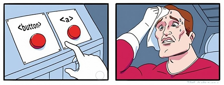
There seems to be a general thought process of “link vs button” and really, what might help us better understand either one (or both) is to start with the statement “a link is not a button and a button is not a link”. Then, address each as equals, as they are simply different tools that we can use in our documents.
Let's get down to some specifics about the button element.
A button can be of three types: ‘submit’, ‘reset’, and ‘button’. If no type value is declared, or if the value declared is invalid, then the default is ‘submit’. So for those of you building within any JS framework, if you want to build a reusable button component that can take any function as its associated triggered action, make sure to declare your type as ‘button’.
Again: if a button is within the scope of a form, if it is not specified to have a certain action attached to it, it will try to submit that form.
When it comes to form processing and submission, especially within a JavaScript framework, it may be easier to instead use <input type=“reset”> and <input type=“submit”> for your form needs. Granted, they take a little more work in changing their visual appearance, but they will be “better citizens” with less oversight needed.
Quite often, buttons are rendered only as icons, with no other text content to describe their meaning or use. For instance, social linking and sharing buttons, with only the brand icon visibly rendered. It is imperative to attach a name to the button in order to pass a11y tests. Please note, the methods used to hide button text in those cases is outside the scope of this post, but can be easily found throughout the web.
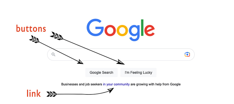
If you want your users to know when something will trigger an action, consider keeping your buttons looking like, well, buttons. If you want your users to know they will be directed to a new location on the page, or to a new page entirely, allow your links to continue visually appearing as links.
Buttons are for actions, like opening a dialog, a modal, or initiating a log in. If they exist within the domain of a form without specified alternate attributes, they will submit the form. Note: but if you are submitting a form, you should be using <input type=“submit”> instead.
Buttons are not meant for anything related to navigation. That is not their purpose. That is the job of the navigation and anchor elements!
To underscore this point further, humans who use readers and VoiceOver methods to navigate the internet, expect a link to be triggered by the ‘enter’ key, and a button to be triggered by the space key. These separate mechanics alone should show you that there is a key difference between the button element and the anchor element.
Another seeming popular use of the button element is to use it as a “toggle” switch. I believe this is simply a holdover from past years, especially within more JavaScript-centric developer circles. A better option is to use the <input type=“checkbox”> element, as it lends itself much better than the button to the mechanics of what inherently makes a toggle object. We will cover how that is achieved when we focus on that input type.
Nearly last, and definitely not least, there is a standard suggested minimum size for a button, since the size suggested is for any interactive object on a page. The minimum suggested size is 44 x 44 pixels. This is based on human anatomy, and probably won’t change anytime soon!
Finally, what about those pesky divs that always seem to crop up as wrappers for button components? Fortunately it seems that much of the divitus that came with developing with React is beginning to be re-written, as React (sorry React Bros) provided a way to build DOM elements without the need for a base wrapper and the same now goes for Vue.
However, just as you can lead a horse to water, but you can’t make it drink, so too various JavaScript frameworks can provide a means of rendering well-structured HTML documents, but if the developer doesn’t know, or worse, refuses to acknowledge those beneficial methods, we will still end up with a significant amount of unneeded divs in the DOM.
I believe if we continue to communicate in a non-blaming/non-shaming manner and simply point out the benefits of cleaner code, we can make rippling, happy affects throughout many developer communities.
Remember that when building for accessibility, it is not meant building “for blind people”. Anyone who has dim eyesight can use VoiceOver to aid in document navigation. People who have severe arthritis or a lack of fine-motor control in their hands, would also want to use some other method besides using a mouse, as a means of clicking things on the page.
Reference:
- WHATWG
- the-button-element
- caniuse.com
- mdn-html_elements_button
- MDN Docs
- Web/HTML/Element/button